金桔
金币
威望
贡献
回帖0
精华
在线时间 小时
|
登陆有奖并可浏览互动!
您需要 登录 才可以下载或查看,没有账号?立即注册


×
免疫浸润结果可视化
在之前的推文中我们介绍了2行代码实现9种免疫浸润方法,今天给大家介绍下常见的免疫浸润结果的可视化。
就以大家最常见的cibersort为例进行介绍。
首先大家要对每种免疫浸润方法的结果有一个大体的认知,比如cibersort的结果是各种免疫细胞在样本中的比例,所以一个样本中所有的免疫细胞比例加起来总和是1!
但是ssGSEA就不是这样了。
只有理解了结果是什么样的,你才能选择合适的可视化方法。数就是图,图就是数
library(tidyHeatmap)
library(tidyverse)
library(RColorBrewer)
# 首先变为长数据
cibersort_long <- im_cibersort %>%
select(`P-value_CIBERSORT`,Correlation_CIBERSORT, RMSE_CIBERSORT,ID,everything()) %>%
pivot_longer(- c(1:4),names_to = "cell_type",values_to = "fraction") %>%
dplyr::mutate(cell_type = gsub("_CIBERSORT","",cell_type),
cell_type = gsub("_"," ",cell_type))
head(cibersort_long[,4:6])
## # A tibble: 6 × 3
## ID cell_type fraction
## <chr> <chr> <dbl>
## 1 TCGA-D5-6540-01A-11R-1723-07 B cells naive 0.0504
## 2 TCGA-D5-6540-01A-11R-1723-07 B cells memory 0
## 3 TCGA-D5-6540-01A-11R-1723-07 Plasma cells 0
## 4 TCGA-D5-6540-01A-11R-1723-07 T cells CD8 0.119
## 5 TCGA-D5-6540-01A-11R-1723-07 T cells CD4 naive 0
## 6 TCGA-D5-6540-01A-11R-1723-07 T cells CD4 memory resting 0.0951如果你是初学者,也可以直接用IOBR为大家提供的cell_bar_plot()函数,可以直接帮你转换为长数据,并且还可以把图画出来。
res_cibersort <- cell_bar_plot(im_cibersort)
## There are seven categories you can choose: box, continue2, continue, random, heatmap, heatmap3, tidyheatmap
## >>>>=== Palette option for random: 1: palette1; 2: palette2; 3: palette3; 4: palette4
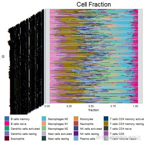
但是这个图你可能不能接受,没关系,转换好的长数据已经在res_cibersort这个对象里了。
head(res_cibersort$data)
## ID cell_type fraction
## 1 TCGA-D5-6540-01A-11R-1723-07 B cells naive 0.05044811
## 2 TCGA-AA-3525-11A-01R-A32Z-07 B cells naive 0.11573408
## 3 TCGA-AA-3525-01A-02R-0826-07 B cells naive 0.06545120
## 4 TCGA-AA-3815-01A-01R-1022-07 B cells naive 0.03903166
## 5 TCGA-D5-6923-01A-11R-A32Z-07 B cells naive 0.02560987
## 6 TCGA-G4-6322-01A-11R-1723-07 B cells naive 0.08727238和我们自己转换的是差不多的,这个数据就可以直接使用ggplot2自己画图了:
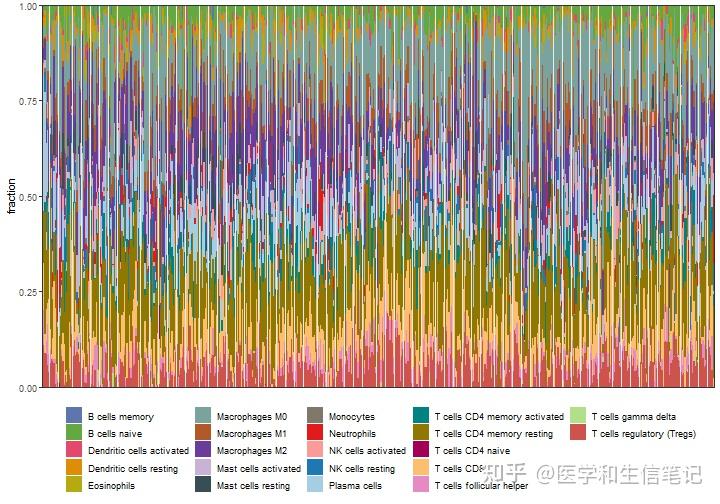
p1 <- cibersort_long %>%
ggplot(aes(ID,fraction))+
geom_bar(stat = "identity",position = "stack",aes(fill=cell_type))+
labs(x=NULL)+
scale_y_continuous(expand = c(0,0))+
scale_fill_manual(values = palette4,name=NULL)+ # iobr还给大家准备了几个色盘,贴心!
theme_bw()+
theme(axis.text.x = element_blank(),
axis.ticks.x = element_blank(),
legend.position = "bottom"
)
p1
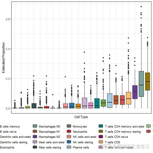
除了这个最常见的堆叠条形图,还可以画箱线图,热图。
# 有顺序的箱线图
library(forcats)
p2 <- ggplot(cibersort_long,aes(fct_reorder(cell_type, fraction),fraction,fill = cell_type)) +
geom_boxplot() +
#geom_jitter(width = 0.2,aes(color=cell_type))+
theme_bw() +
labs(x = "Cell Type", y = "Estimated Proportion") +
theme(axis.text.x = element_blank(),
axis.ticks.x = element_blank(),
legend.position = "bottom") +
scale_fill_manual(values = palette4)
p2
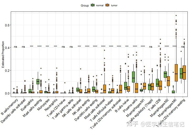
如果你的样本有不同分组,就可以根据画出分组箱线图。比如我这里就根据tumor/normal把样本分组,然后再组间进行非参数检验,并添加P值。
这些都是R语言基础操作,本号的可视化合集中介绍了太多这些基本绘图知识了。
library(ggpubr)
library(stringr)
# 分组
cibersort_long$Group = ifelse(as.numeric(str_sub(cibersort_long$ID,14,15))<10,"tumor","normal")
p3 <- ggplot(cibersort_long,aes(fct_reorder(cell_type,fraction),fraction,fill = Group)) +
geom_boxplot(outlier.shape = 21,color = "black") +
scale_fill_manual(values = palette1[c(2,4)])+
theme_bw() +
labs(x = NULL, y = "Estimated Proportion") +
theme(legend.position = "top") +
theme(axis.text.x = element_text(angle=45,hjust = 1),
axis.text = element_text(color = "black",size = 12))+
stat_compare_means(aes(group = Group,label = ..p.signif..),
method = "kruskal.test",label.y = 0.4)
p3
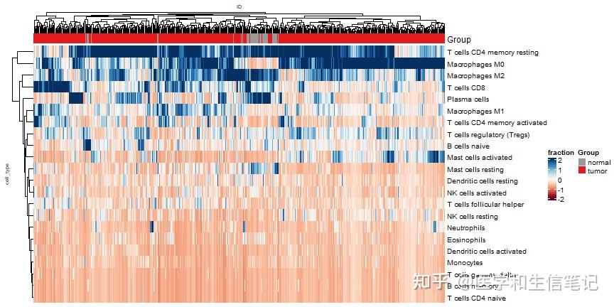
热图也是一样的easy,而且有了tidyHeatmap的加持,直接使用长数据即可,不用在变为宽数据了!
可以参考文章:tidyHeatmap完美使用长数据的热图可视化
library(tidyHeatmap)
p4 <- heatmap(.data = cibersort_long
,.row = cell_type
,.column = ID
,.value = fraction
,scale = "column"
,palette_value = circlize::colorRamp2(
seq(-2, 2, length.out = 11),
RColorBrewer::brewer.pal(11, "RdBu")
)
,show_column_names=F
,row_names_gp = gpar(fontsize = 10),
column_names_gp = gpar(fontsize = 7),
column_title_gp = gpar(fontsize = 7),
row_title_gp = gpar(fontsize = 7)
) %>%
add_tile(Group) # 新版本已经改了,注意
p4
ssGSEA的可视化方法也是类似的,不过就没有堆叠条形图了,因为加和不是1,堆叠起来就会参差不齐,毫无美感。
常用的还是箱线图这种样式的。
ssgsea_long <- im_ssgsea %>%
pivot_longer(- ID,names_to = "cell_type",values_to = "Score")
head(ssgsea_long)
## # A tibble: 6 × 3
## ID cell_type Score
## <chr> <chr> <dbl>
## 1 TCGA-3L-AA1B-01A-11R-A37K-07 Activated B cell -0.192
## 2 TCGA-3L-AA1B-01A-11R-A37K-07 Activated CD4 T cell 0.0120
## 3 TCGA-3L-AA1B-01A-11R-A37K-07 Activated CD8 T cell 0.170
## 4 TCGA-3L-AA1B-01A-11R-A37K-07 Activated dendritic cell 0.00545
## 5 TCGA-3L-AA1B-01A-11R-A37K-07 CD56bright natural killer cell 0.199
## 6 TCGA-3L-AA1B-01A-11R-A37K-07 CD56dim natural killer cell 0.351
ggplot(ssgsea_long, aes(cell_type, Score))+
geom_violin(width=2.0,aes(color=cell_type))+
geom_boxplot(width=0.2,fill="black") +
theme_bw() +
labs(x = NULL) +
theme(axis.text.x = element_blank(),
axis.ticks.x = element_blank(),
legend.position = "bottom") +
#scale_fill_manual(values = palette4)+
scale_color_manual(values = palette4,name=NULL)
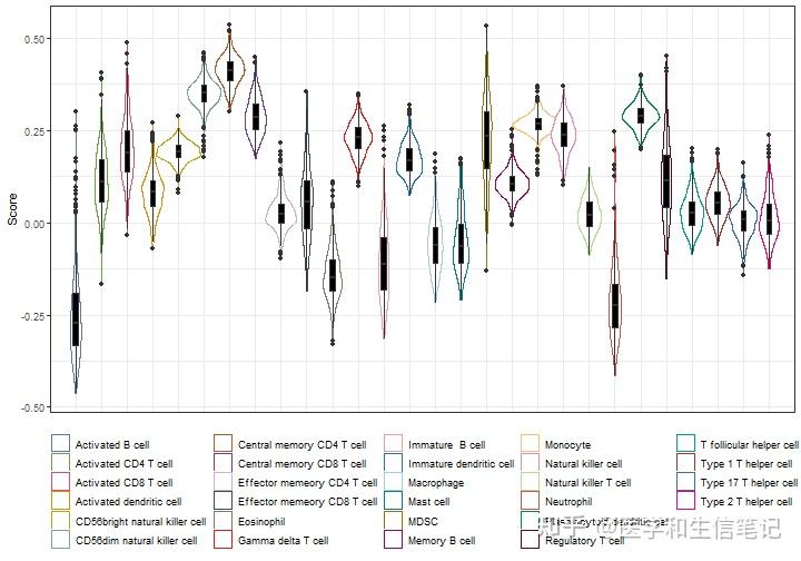
除此之外也是可以添加分组,画热图等,其他的免疫浸润结果也是同样的可视化思路,这里就不再重复了,大家自己尝试下即可。
和分子联系起来
如果和某个分子联系起来,又可以画出各种花里胡哨的图,比如棒棒糖图,热图,散点图等。
我这里是以ssGSEA的结果为例进行演示的,其他的都是一样的。
我们就以CTLA4 EGFR PDL1 BRAF "VEGFB" "VEGFA" "VEGFC" "VEGFD" "NTRK2" "NTRK1" "NTRK3"这几个分子为例吧。
genes <- c("CTLA4","EGFR","PDL1","BRAF","KRAS","VEGFA","VEGFB","VEGFC","VEGFD","NTRK1","NTRK2","NTRK3")
genes_expr <- as.data.frame(t(expr_coad[rownames(expr_coad) %in% genes,]))
genes_expr <- genes_expr[match(im_ssgsea$ID,rownames(genes_expr)),]
identical(im_ssgsea$ID,rownames(genes_expr))
## [1] TRUE接下来就是批量计算每一个基因和28种细胞之间的相关系数和P值,这个需求你可以写循环实现,或者apply系列,purrr系列等,但是我试过,都太慢了,尤其是数据量很大的时候。
所以我这里给大家介绍一种更快的方法,借助linkET包实现,这个包在之前也介绍过了:mantel-test可视化,别再只知道ggcor!
library(linkET)
##
## Attaching package: 'linkET'
## The following object is masked from 'package:purrr':
##
## simplify
## The following object is masked from 'package:ComplexHeatmap':
##
## anno_link
cor_res <- correlate(genes_expr, im_ssgsea[,-1],method = "spearman")
qcorrplot(cor_res) +
geom_square() +
scale_fill_gradientn(colours = RColorBrewer::brewer.pal(11, "RdBu"))
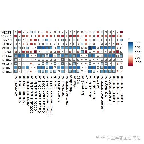
但是这个图并没有明显的表示出P值,所以我知道大家想自己画的更加花里胡哨一点,在很久之前我就介绍过了这个方法了:R语言ggplot2画相关性热图
画图前先准备下数据,把P值数据和相关系数数据整合到一起,所以借助linkET包也是有缺点的,如果自己写函数肯定是直接弄好的。
# 先整理下数据
df_r <- cor_res$r %>%
as.data.frame() %>%
rownames_to_column(var = "gene") %>%
pivot_longer(-1,names_to = "cell_type",values_to = "correlation")
df_p <- cor_res$p %>%
as.data.frame() %>%
rownames_to_column(var = "gene") %>%
pivot_longer(-1,names_to = "cell_type",values_to = "pvalue")
df_cor <- df_r %>%
left_join(df_p) %>%
mutate(stars = cut(pvalue,breaks = c(-Inf,0.05,0.01,0.001,Inf),right = F,labels = c("***","**","*"," ")))
## Joining with `by = join_by(gene, cell_type)`
head(df_cor)
## # A tibble: 6 × 5
## gene cell_type correlation pvalue stars
## <chr> <chr> <dbl> <dbl> <fct>
## 1 VEGFB Activated B cell 0.0837 5.55e- 2 " "
## 2 VEGFB Activated CD4 T cell -0.338 2.35e-15 "***"
## 3 VEGFB Activated CD8 T cell 0.0417 3.41e- 1 " "
## 4 VEGFB Activated dendritic cell -0.0181 6.79e- 1 " "
## 5 VEGFB CD56bright natural killer cell 0.287 2.48e-11 "***"
## 6 VEGFB CD56dim natural killer cell 0.289 1.82e-11 "***"数据都有了,画图就行了。ggplot2搞定一切,求求大家赶紧学学ggplot2吧,别再天天问图怎么画了。两本说明书,随便买一本认真看看就搞定了:《R数据可视化手册》或者《ggplot2:数据分析与图形艺术》
library(ggplot2)
ggplot(df_cor, aes(cell_type,gene))+
geom_tile(aes(fill=correlation))+
geom_text(aes(label=stars), color="black", size=4)+
scale_fill_gradient2(low='#67B26F', high='#F2AA9D',mid = 'white',
limit=c(-1,1),name=paste0("* p < 0.05","\n\n","** p < 0.01","\n\n","*** p < 0.001","\n\n","Correlation"))+
labs(x=NULL,y=NULL)+
theme(axis.text.x = element_text(size=8,angle = 45,hjust = 1,color = "black"),
axis.text.y = element_text(size=8,color = "black"),
axis.ticks.y = element_blank(),
panel.background=element_blank())
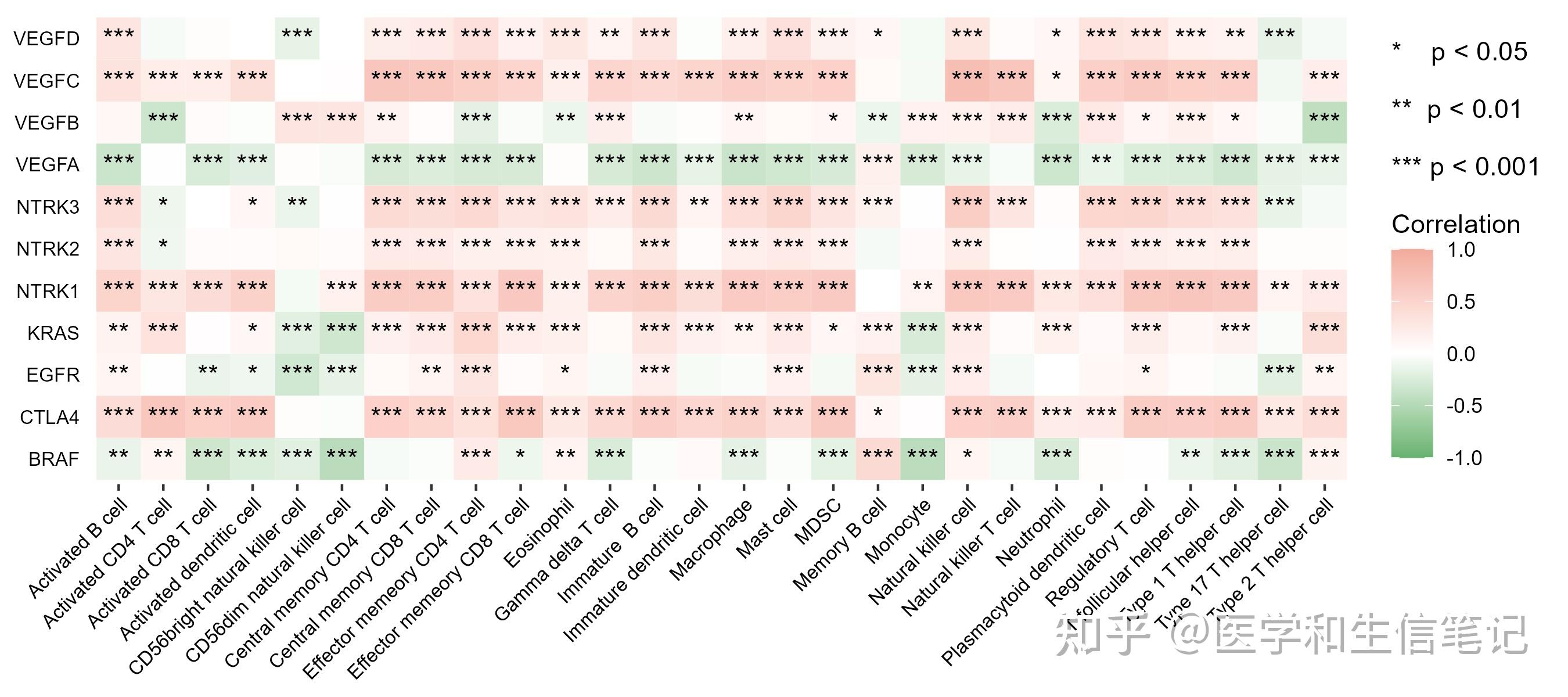
ggsave("df_cor.png",height = 4,width = 9) # 保存时不断调整长宽比即可得到满意的图形棒棒糖图也是一样的简单,我们之前也介绍过了:你还不会画棒棒糖图?
不过这种展示的是1个基因和其他细胞的关系,就是1对多的关系展示,上面的热图是多对多的关系展示。
# 以EGFR为例
df_egfr <- df_cor %>%
filter(gene=="EGFR")
text_color <- c(rep("red",4),rep("#FDD819",1),rep("#67B26F",1),rep("#C4E0E5",12),rep("#67B26F",2),rep("#FDD819",3),rep("red",5))
ggplot(df_egfr, aes(correlation, fct_reorder(cell_type,correlation)))+
geom_segment(aes(xend = 0,yend = cell_type),color="grey70",size=1.2)+
geom_point(aes(size = abs(correlation), color=factor(stars)))+
scale_color_manual(values = c("red","#FDD819","#67B26F","#C4E0E5"),name="P-value")+
scale_size_continuous(range = c(3,8),name="Correlation")+
labs(x=NULL,y=NULL)+
theme_bw()+
theme(axis.text.x = element_text(color="black",size = 14),
axis.text.y = element_text(color = text_color,size = 14)#给标签上色没想到特别好的方法
)
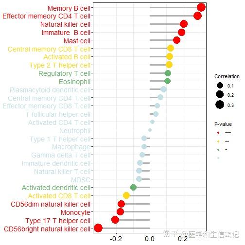
ggsave("df_egfr.png",width = 8,height = 8)除此之外,你还可以可视化1个基因和1个细胞之间的关系,用散点图或者散点图矩阵的形式。
我们可以直接使用ggplot2里面的分面,画一张图。
# 还是以EGFR为例
df_egfr_scatter <- im_ssgsea %>%
mutate(EGFR = genes_expr[,"EGFR"],.before = 1) %>%
pivot_longer(-c(1,2),names_to = "cell_type",values_to = "score")画图即可:
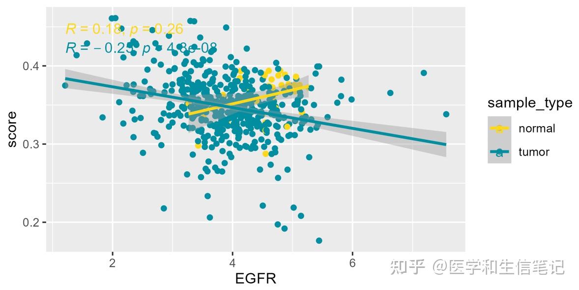
ggplot(df_egfr_scatter, aes(EGFR,score))+
geom_point()+
geom_smooth(method = "lm",color="blue")+
stat_cor(method = "spearman",color="red")+
facet_wrap(~cell_type,scales = "free_y",ncol = 5)
## `geom_smooth()` using formula = 'y ~ x'
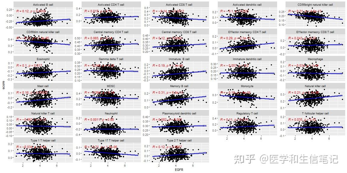
ggsave("df_facet.png",width = 14,height = 8)
## `geom_smooth()` using formula = 'y ~ x'注意:到目前为止我们用的都是所有样本,tumor和normal都有! 我们也可以按照tumor和normal分个组,再画图:
df_egfr_scatter$sample_type <- ifelse(as.numeric(substr(df_egfr_scatter$ID,14,15))<10,"tumor","normal")
ggplot(df_egfr_scatter, aes(EGFR,score,color=sample_type))+
geom_point()+
geom_smooth(method = "lm")+
stat_cor(method = "spearman")+
scale_color_manual(values = c('#FDD819','#028EA1'))+
facet_wrap(~cell_type,scales = "free_y",ncol = 5)
## `geom_smooth()` using formula = 'y ~ x'
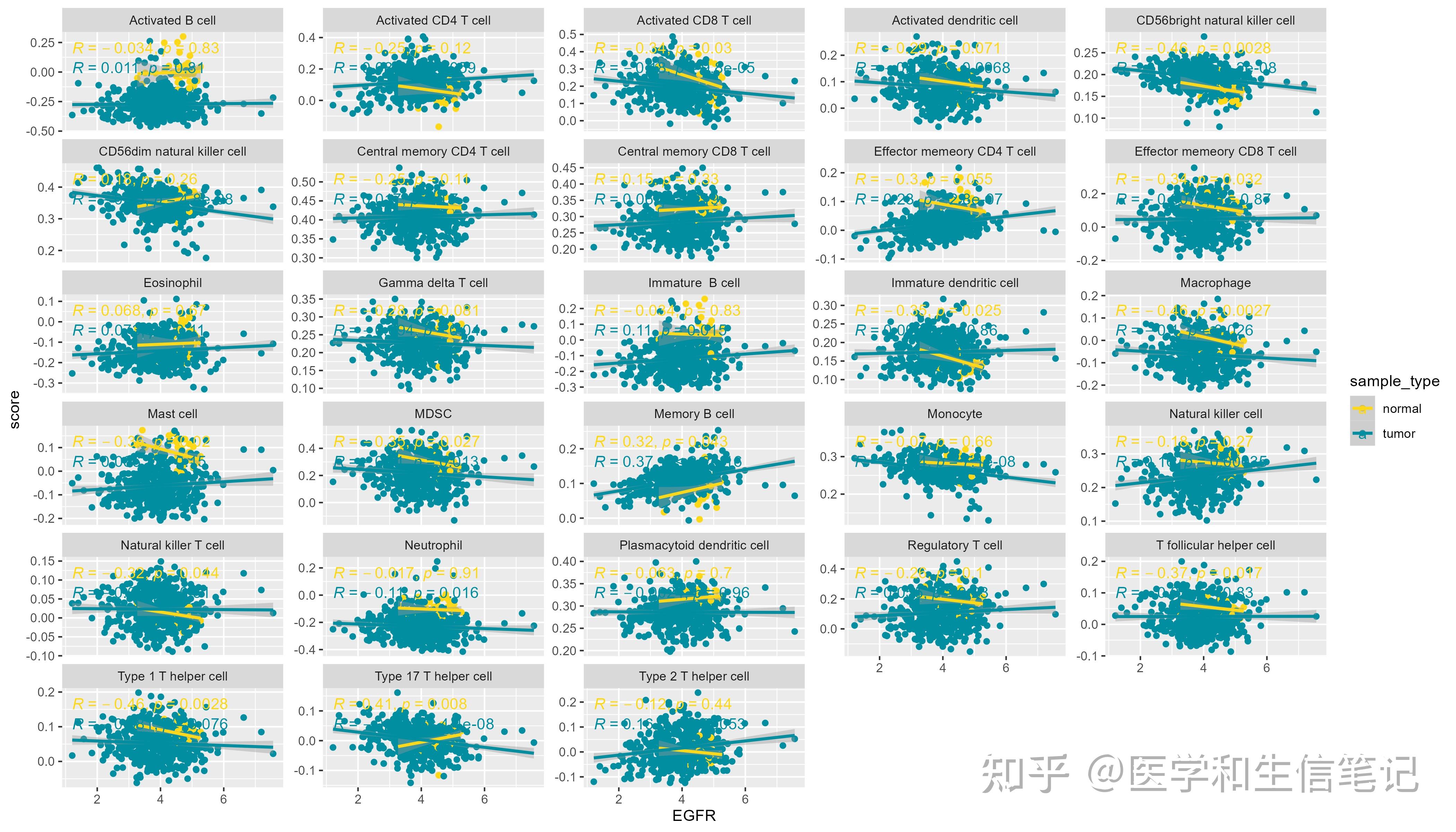
ggsave("df_facet_two.png",width = 14,height = 8)
## `geom_smooth()` using formula = 'y ~ x'如果你需要单独画图,并保存,也是可以的,都没有问题,只要你基础够扎实,想做什么都可以,你R语言基础不行,啥都做不出来。
# 还是以EGFR为例
df_egfr_scatter %>%
filter(cell_type == "Activated B cell") %>%
ggplot(aes(EGFR, score,color=sample_type))+
geom_point()+
geom_rug(aes(color=sample_type))+
geom_smooth(method = "lm")+
stat_cor(method = "spearman")+
scale_color_manual(values = c('#FDD819','#028EA1'))+
theme_bw()
## `geom_smooth()` using formula = 'y ~ x'
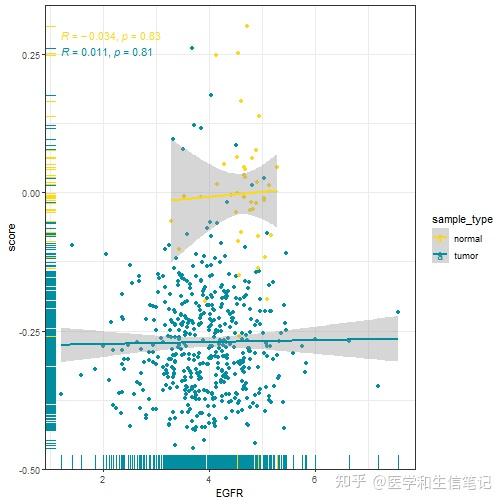
是不是很简单呢?
然后你可以循环出图并保存到本地,不过我并没有使用上面这种花里胡哨的图,你可以自己修改:
library(purrr)
plot_list <- df_egfr_scatter %>%
split(.$cell_type) %>% # group_split没有名字
map(~ ggplot(., aes(EGFR,score,color=sample_type))+
geom_point()+
geom_smooth(method = "lm")+
stat_cor(method = "spearman")+
scale_color_manual(values = c('#FDD819','#028EA1'))
)
paths <- paste0(names(plot_list),".png")
pwalk(list(paths, plot_list),ggsave,width=6,height=3)28张图片已保存到本地:
每一张都长这样:
OK,就先介绍到这里,关于结果的可视化,我这里介绍的只是最常见的,冰山一角而已,毕竟可视化方法太多了,不可能全都介绍到。
大家如果有喜欢的图形,可通过评论区,粉丝QQ群等方式发给我~
原文地址:https://zhuanlan.zhihu.com/p/655377268 |
|

 /3
/3 

 浙公网安备33010802005999号


 2026庆【网站十三周
 2025庆【网站十二周
 2024庆中秋、迎国庆
 2024庆【网站十一周
 2023庆【网站十周年
 2022庆【网站九周年

 雷达卡
雷达卡 发表于 2025-3-12 20:10
 提升卡
提升卡